

Have you ever wondered how an inflation graph can help explain rising prices? Think of it as a visual diary that tracks cost changes over time. It’s like glancing at a scoreboard during a game, each point gives you a quick look at market trends.
In this guide, we lay out the basics in a simple, clear way. We break down how to read these graphs so that even complex data feels manageable. Have you ever noticed how a quick snapshot of trends can change your view on the market?
How to read an inflation graph with ease
An inflation graph is a useful tool that helps you see how prices change over time. The horizontal line (X-axis) usually marks months or years, while the vertical line (Y-axis) shows the percentage change. It’s much like reading a calendar where days line up to give you a clear picture of time, making it easier for beginners to grasp the basics.
Take the Consumer Price Index (CPI) as an example. This index tracks the average change in prices for everyday items and is updated each month by the Bureau of Labor Statistics. You'll also notice that many inflation graphs include legends to help you tell different data series apart, like the CPI, core CPI (which leaves out food and fuel), the Producer Price Index (PPI), and Personal Consumption Expenditures (PCE). Each label clarifies what you’re looking at and keeps things from getting confusing.
The right scales on both axes are important, too. They help ensure that the visual story isn’t misleading by exaggerating price swings, so the data remains honest and relevant. Often, you might see a note advising you to "check US inflation rate today" or to look over the latest CPI report for more insights. All of these parts come together to create a clear picture of inflation trends that is easy to follow.
Interpreting Inflation Graph Trends: Spotting Monthly and Annual Patterns
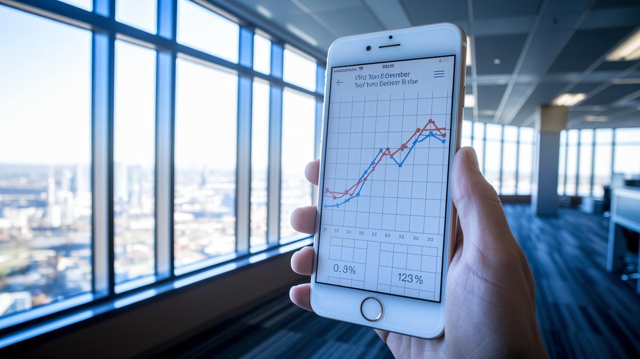
Inflation graphs tell us two different stories, one in the month-to-month changes and another in the year-over-year shifts. For instance, a quick 0.3% rise in December’s CPI can grab your attention right away. This move might be due to seasonal factors or specific base effects, so it’s smart to compare it with annual data.
Looking over the past year, the overall CPI increased by 2.7%, while the core CPI, which excludes food and fuel, climbed by 2.6%. This broader view helps you understand how prices are really moving over time.
One way to read the graph is to see when the ups and downs of each month smooth out into a clear trend. It’s a bit like checking the pulse of the economy. A sudden monthly spike might flip back in the next few months, hinting at temporary price pressures. In contrast, a steady annual inflation rate, typically around the 2% target set by the Federal Reserve, signals balanced economic growth.
Did you know a small rise of just 0.3% can stir up serious market chatter? It’s like a tiny ripple that might be the precursor to bigger waves.
By studying both the short-term blips and long-term trends, you get a clearer picture of inflation’s direction. For more detailed insights, you might want to check out the latest inflation outlook and expert reviews. Keeping an eye on both monthly and yearly movements not only reveals current changes in consumer prices but also hints at what might be coming next.
Comparing Inflation Rate Lines: CPI vs PPI vs PCE on Graphs
When you glance at an inflation graph, you'll see that each line tells its own story about price changes. The CPI line shows everyday expenses in a steady, predictable way, much like a reliable friend who sticks to a routine. On the other hand, the PPI line is a bit more unpredictable since it tracks prices from the producer’s viewpoint. For example, in November the PPI jumped by 0.2% and rose 3.0% compared to last year. Meanwhile, the PCE line gives us the bigger picture of consumer spending, with current-dollar PCE spending increasing by $108.7 billion, a clear sign that spending habits are shifting.
Think of these three lines as runners in a race. The CPI runner keeps a consistent pace, the PPI runner dashes in spurts, and the PCE runner varies its speed throughout the race. This side-by-side look helps you quickly understand different market pressures and how seasonal changes play a role.
To make your graph even clearer, use easy-to-read legends, distinct colors, and defined markers. For example, you could choose blue for CPI, red for PPI, and green for PCE, making it simple to see differences in movement and seasonality.
Small example snippet: "Picture a chart where the blue line (CPI) steadily climbs, the red line (PPI) leaps during key months, and the green line (PCE) moves with more variation."
| Inflation Measure | Monthly Change | Annual Change |
|---|---|---|
| CPI | ~0.3% | 2.7% |
| PPI | 0.2% (November) | 3.0% |
| PCE | Varies | Reflects broader consumer spending shifts |
Looking at these lines together makes it easier to spot month-to-month changes and longer-term trends. This side-by-side comparison is a handy tool for understanding the subtle effects of market shifts and the overall dynamics of inflation.
Step-by-Step Guide to Analyzing an Inflation Graph

When you study an inflation graph, take a moment to note how changes over time and seasonal tweaks can shift your view. Comparing nearby data points can reveal trends that a basic look might miss.
-
Begin by understanding the context. Check if the graph shows headline inflation or core inflation. Sometimes, charts omit food and fuel to highlight the underlying trend.
-
Look for seasonal adjustments. These markers explain when temporary factors are at play, helping you tell apart short-term bumps from longer, steady changes.
-
Dive into the numbers by calculating period changes. Use the inflation rate formula (details here: https://smartfinancialtrends.com?p=753) to compare successive points. Even a slight increase, from 0.2% to 0.3%, might hint at a meaningful trend if compared with previous readings.
-
Combine these insights with other features like data labels. For example, if December shows a 0.3% increase against a 2.5% annual change, that could signal the role of seasonal influences.
Taking these steps can give you a clearer, more complete view of inflation trends.
Tools and Techniques for Inflation Data Visualization
Line charts are great for displaying constant changes in inflation over months or years. Imagine a line smoothly rising to show how prices slowly increase. This simple view helps busy professionals grasp the trend at a glance.
Bar charts, on the other hand, work well when comparing specific time periods. They highlight differences between months. For example, a 0.3% rise in one month might pop against a steadier annual trend. Mixing both chart types gives you clear insights into both short-term shifts and long-term trends.
Color-coding is another handy trick. By using different colors for core versus headline data, you simplify the story your charts tell. Picture using blue for core inflation and orange for headline figures. A little color goes a long way toward making data easier to understand.
Adding gridlines and target-rate markers, like the Fed’s goal of 2%, brings extra clarity. These annotations turn abstract numbers into a clear visual target to compare with the actual data. With a few well-placed labels, you make the chart much more intuitive for your viewers.
For more ideas on sharpening your data visualization skills, check out tips for digital business analysis at https://sharingeconom.com?p=1625.
Avoiding Common Pitfalls When Reading an Inflation Graph

Sometimes, charts can trick you. When the vertical scale is squeezed, even tiny price changes can look huge. It might seem like the market is acting wildly, but really it’s just a quirk of the graph.
Another issue is shifting the base period. If the starting point changes, the graph can look like there’s a big jump or drop in inflation when nothing dramatic is happening at all. Always check if the chart clearly splits headline data from core data. Mixing numbers that include food and fuel with those that don’t can blur the overall picture.
Be careful with the legend too. If you don’t know which line is the Consumer Price Index and which is the core CPI, you might draw the wrong conclusions. Misreading the year-over-year changes can lead you to see trends that aren’t actually there.
Here’s a simple checklist to help you read inflation graphs correctly:
| Step | Action |
|---|---|
| 1 | Check if the axis scales are balanced |
| 2 | Ensure the base period hasn’t changed |
| 3 | Separate headline data from core metrics |
Paying attention to these details lets you trust the data more and avoid confusion. Have you noticed how a small tweak in a chart’s design can lead to big misunderstandings? It’s a common pitfall, but one you can easily avoid with a careful review.
Final Words
In the action, we've broken down the key components needed to understand inflation graphs. The discussion covered chart basics, trend spotting, comparison of indicators like CPI and PPI, and hands-on analysis steps. We highlighted clear methods to avoid common pitfalls. This guide makes how to read an inflation graph feel straightforward and practical. The insights shared help you spot changes, compare trends, and ultimately build confidence in your market decisions. Stay informed, keep applying these tips, and feel positive about making smart financial choices.